

Challenge
Create a visual identity for Slow Travel Workation (STW), founded by Aviaja Møller. The company offers slow travelling where you as a customer can combine vacation, education and networking. The trips are based on both inner and outer sustainability (i.e. both as a person and for the planet). STW offers a unique combination of slow travelling, workation and a three-step-process for learning (before, during and after the trip). The target group are business women, 40–65 years, that either works as a CEO in their own company or as an employee with a leading position. The main market is Sweden – but by extension also for coaches in the US that wants to take their groups to Europe. In the travel business almost every company can be a competitor, but Aviaja has not yet seen anyone with the unique offer that STW has. Value words are peace & quiet, community, reliability, happiness, engagement and respect. There are future plans for other types of slow travelling – so the logo needs to be adjustable so that ‘Workation’ can be changed to for example ‘Hiking’ or ‘Dancing’.
Solution
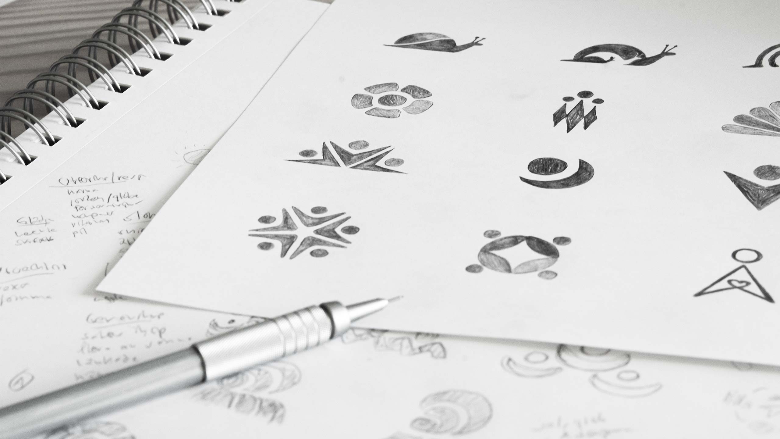
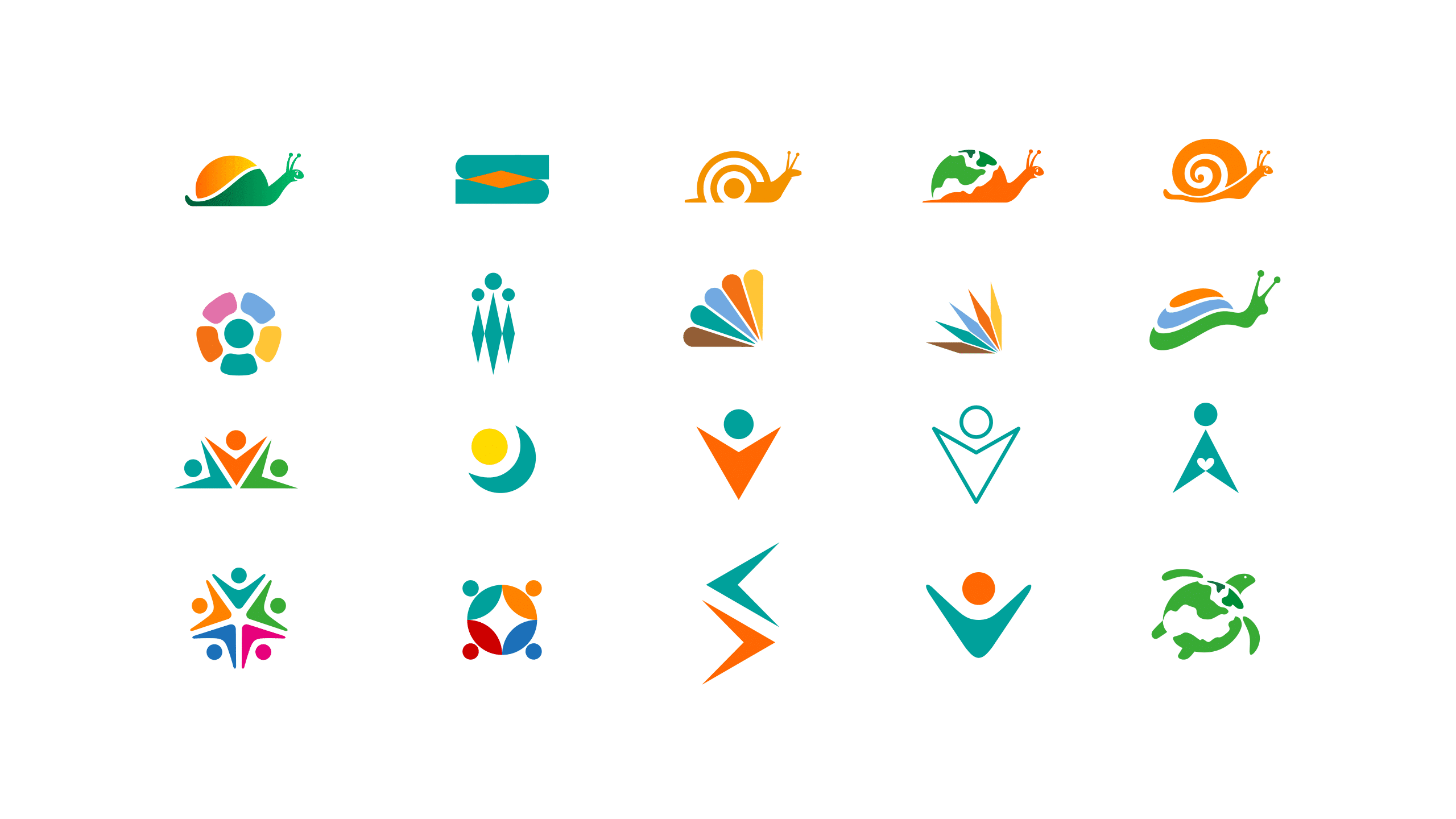
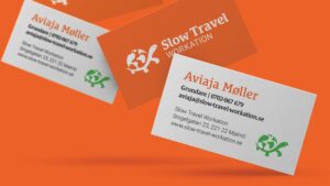
After exploring different paths we chose to use a curious, wandering tortoise as a symbol for the company. By incorporating the globe on the back on the tortoise we have a symbol that visualises both ‘slow’ and ‘travel’. According to Feng Shui the tortoise symbolises health, safety, wisdom and also to share that wisdom – a perfect match for Slow Travel Workation. Since the logo should be able to change to different types of Slow Travel – for example ‘Hiking’ – we have chosen not to visualise ‘Workation’ in the symbol. The logo symbol is supplemented with a typography that is happy, curious and warm. Letters like ‘e’ and ‘a’ are very open in the shapes and feels welcoming. The color palette is bright, warm and happy. Orange and green are main colors for the brand, supplemented by secondary colors to achieve dynamic in more extensive information (like graphs in a Powerpoint presentation).
![]()
I appreciate how you took good time to listen and understand my business before starting designing – it really paid off in the end result. Now I have a professional looking profile for my company, and a new companion – the tortoise Wanda. Thank you Björn!
Aviaja Møller,
Founder of Aviaja Slow Travel AB