

Challenge
Design a logo and visual identity for Eve Stockholm. The company sells unique hand-picked products related to fashion and accessories. The products are sold through an online shop. The founder Eva was born & raised in Sweden, but now lives in Paris. Primary customers are women in the age of 25–45 years old. They want to have a unique style and are willing to put in the time and money to find things they cannot find in their hometown. Many of them follow fashion blogs and are engaged and passionate about fashion and design.
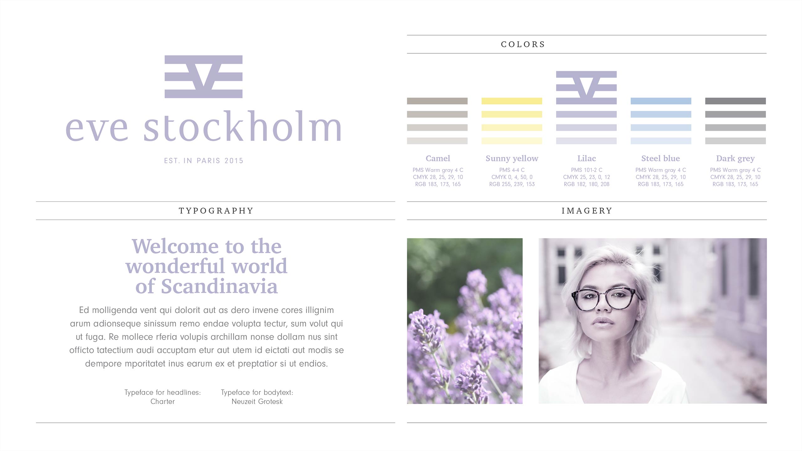
Eve Stockholm will reach their customers via social media and by word-of-mouth. Some of the competitors are MadLady, WestWing, Easy and Sundance Catalogue. Eve Stockholm is all about modern things for the modern woman. Key words are design, Scandinavian look, less is more, quality, classic, feel good, urban chic, romantic, functional & smart, unique, individualism, curiosity, lifestyle, joy of life, metropolitan and cosmopolitan living.
Solution
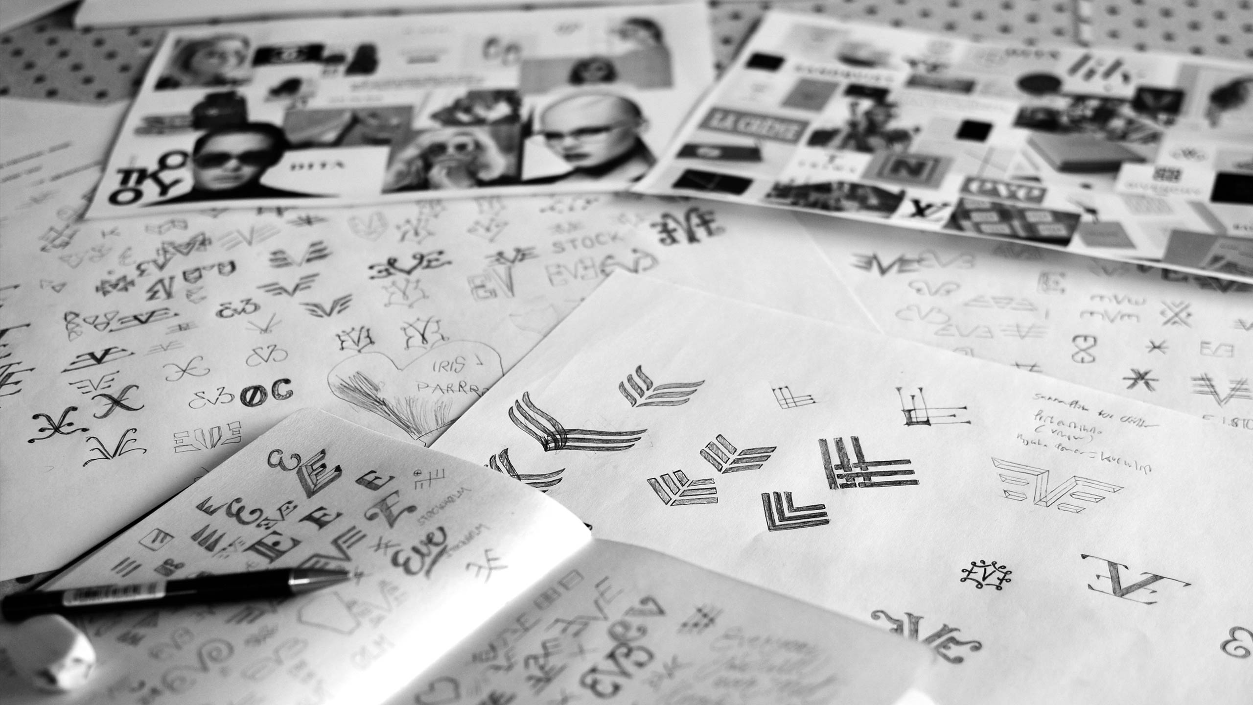
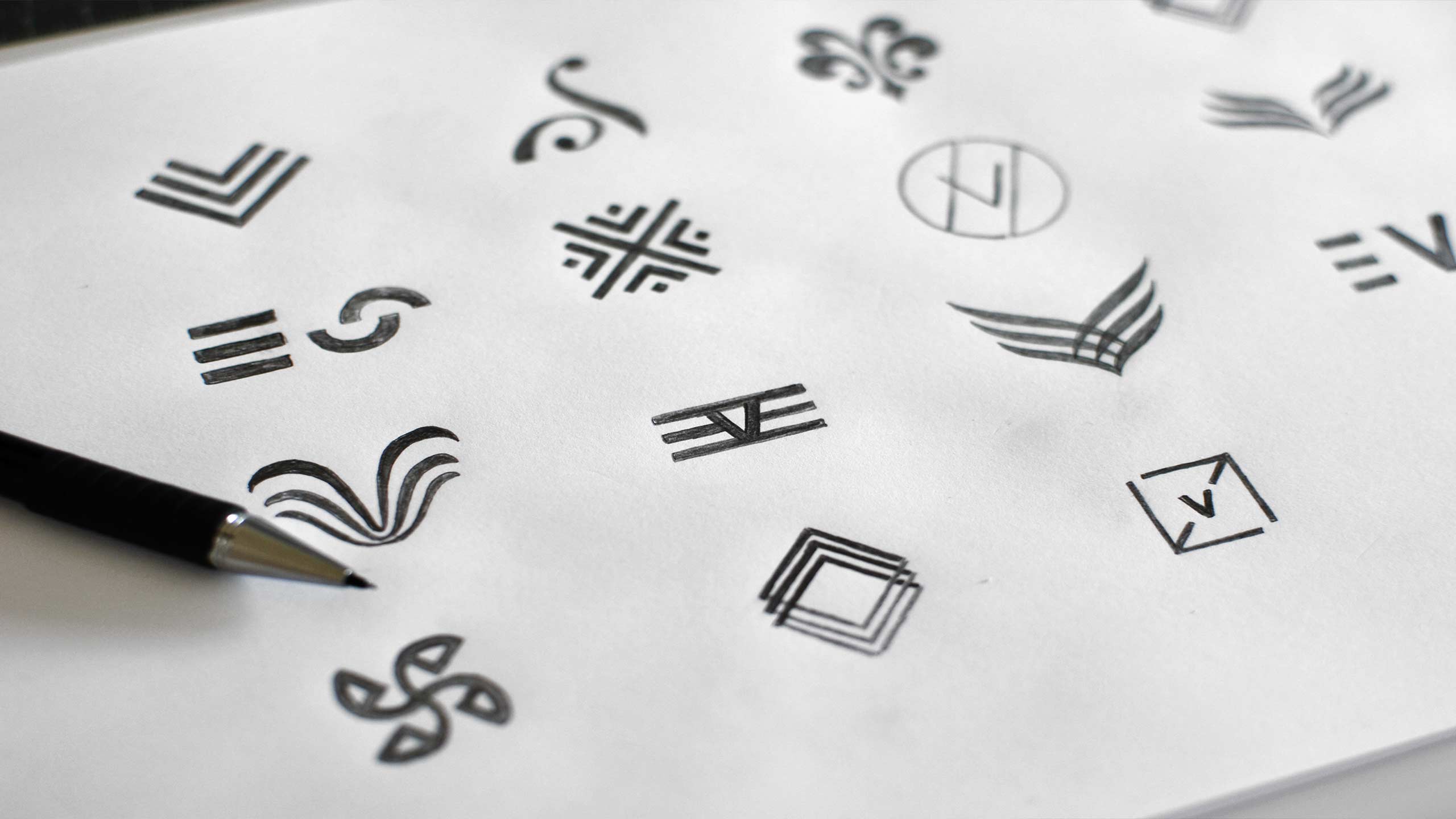
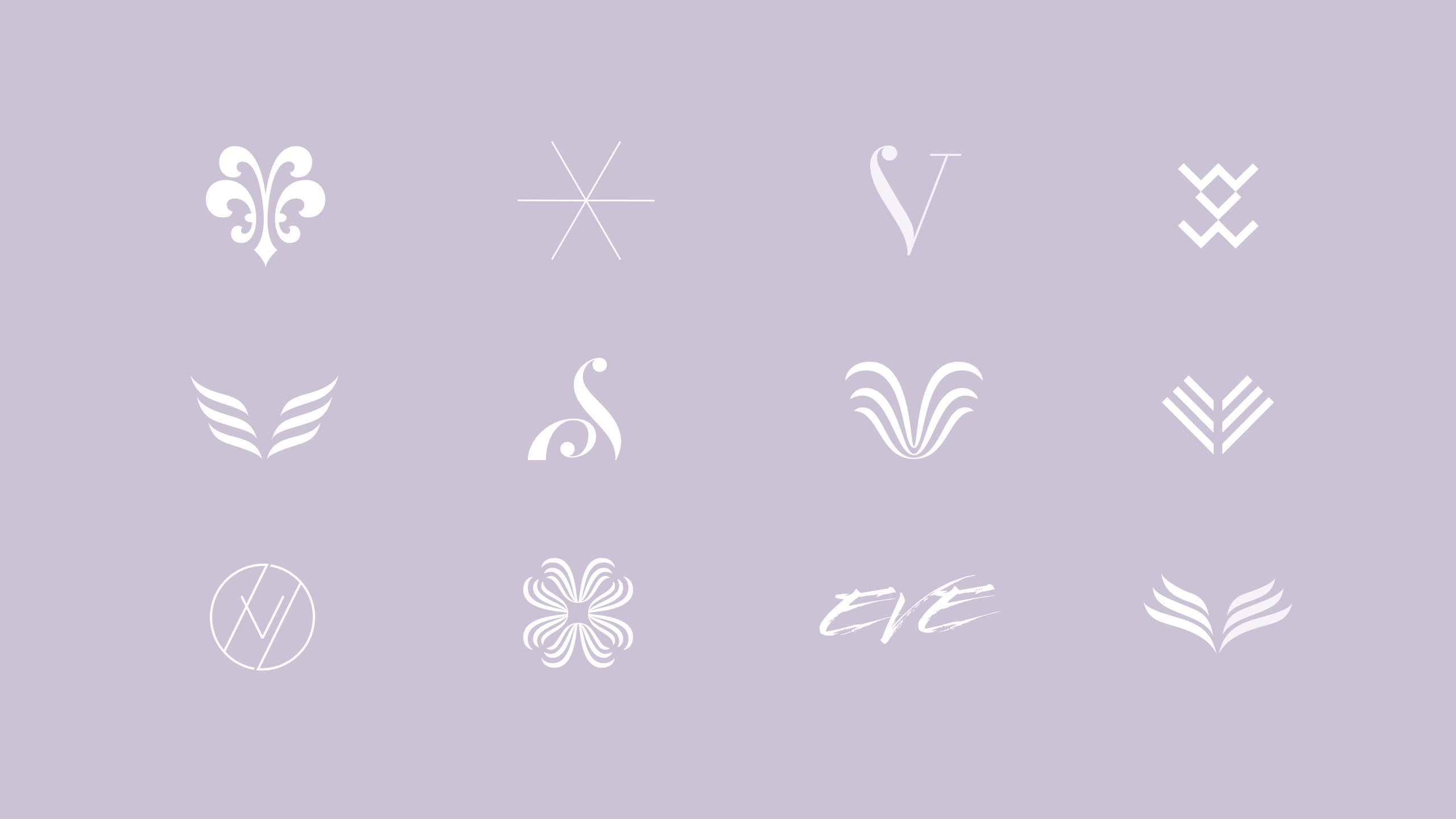
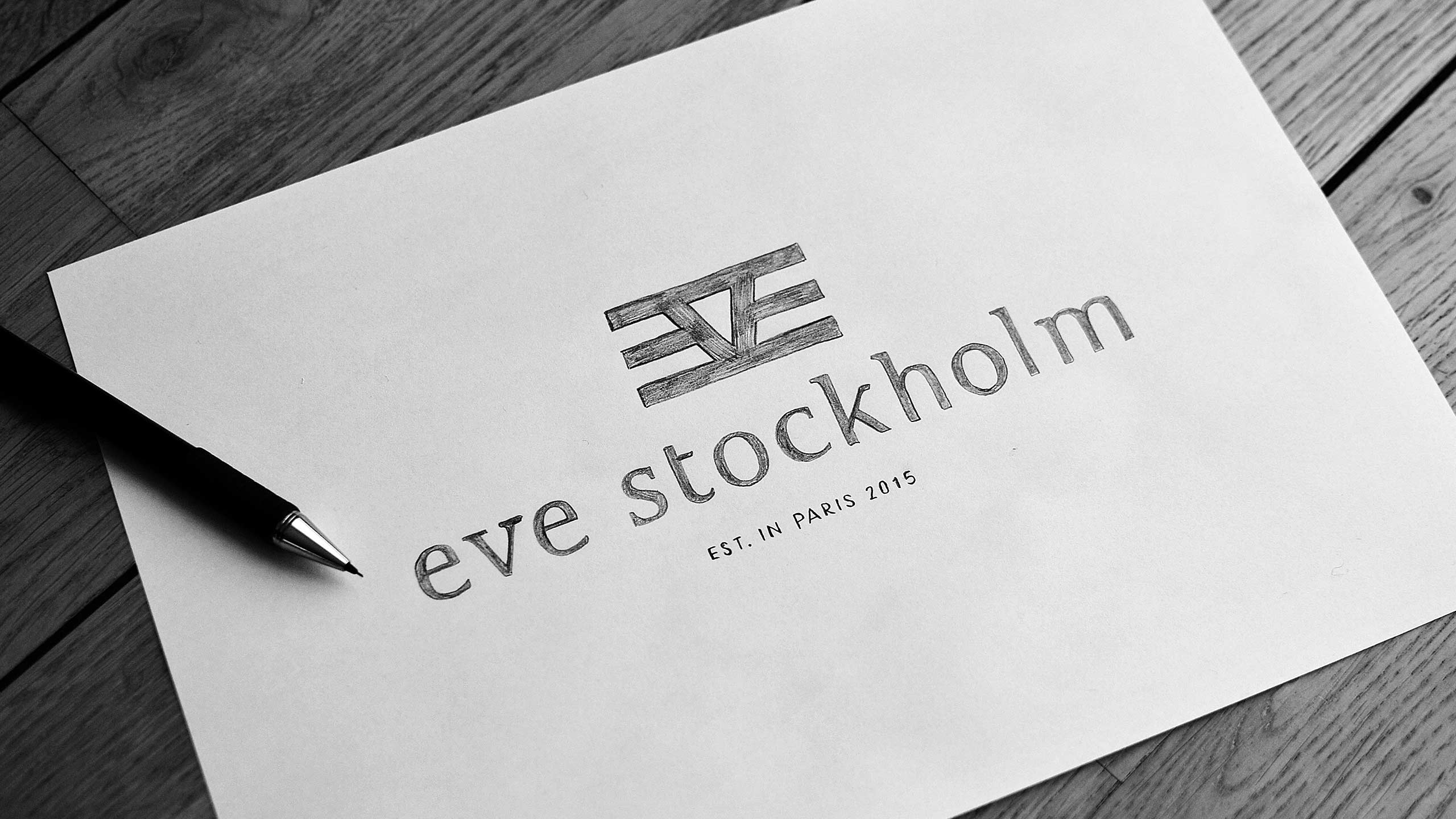
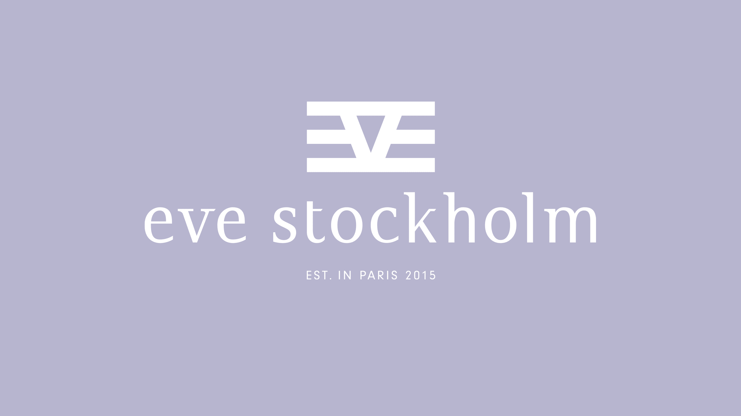
The use of low-case letters gives the logo a feminine and romantic feeling in a subtle way. The symbol is clean and simple. Together they create a logotype that feels modern, urban, clean, cool and Scandinavian with a French touch. The light purple lilac tone enhances the cool, self-confident and feminine feeling. The imagery enhances the urban style. One of the hardest things with this logo project (as to most logo projects) has been creating something that puts the logo in the right industry, i.e. fashion, but at the same time sets it apart from competitors.
The idea of the logo symbol came from Eva´s origin as Swede, but with history in the US and now France. Her history has created a mixed unique style that is the core of the company. So, I stripped down the letters e, v and e to their purest form and created a flag for the land of Eve. I have deliberately made the symbol of the logotype simple in its form. This ensures that the identity is easy to use, versatile and dynamic. The symbol can be used as it is, be filled with images or it can be used as a pattern.
We started out with quite loose ends (really did not know my concept back then) and together we were able to lay down a solid foundation for a business that has to rely on sales to a broader group of consumers, which is definitely less homogenous than the average domestic target group. Our brand is clear, attractive and straight forward. It has a simple romantic Scandinavian touch but with an urban twist, which is exactly what I was looking for!”
Eva Dessolle,
Founder of Eve Stockholm