

Challenge
Create a logotype for Koncept Interiör (KI). The company is founded by Erika Briggner and offers clients different types of homestyling, but also interior design and commercial styling for businesses (like store display windows and campaigns). KI creates attractive interiors that optimises homes before sale. Focus is on details and to create an inviting feeling. KI works a lot with a color scheme consisting of brown, beige and sand – and adds accent colors that makes the home stand out (like adding a dark green pillow or vase). The target group is mainly brokers and they practically works as Erika’s sales persons. End clients are private persons selling their homes. Some of the most important competitors are CMF Homestyling, Ferendum, Interior Ideas, Home Lab, Style by LS, Stz home and AT styling. Value words for KI are: professionalism, personal, happiness, quality, service and an eye for details. Customers appreciate that Erika does that little extra in every project.
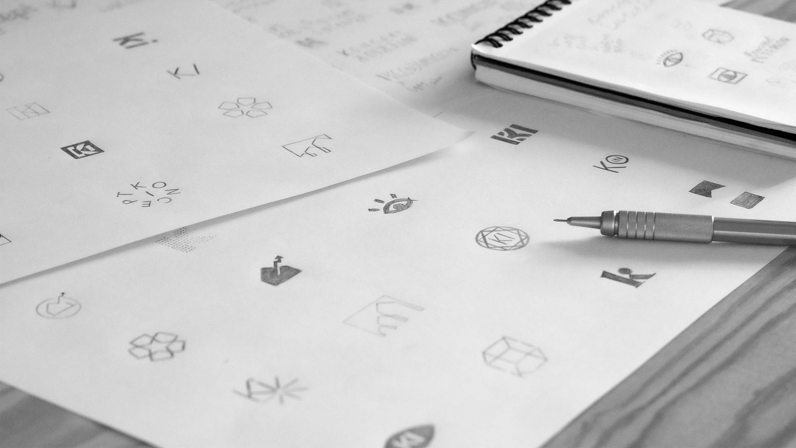
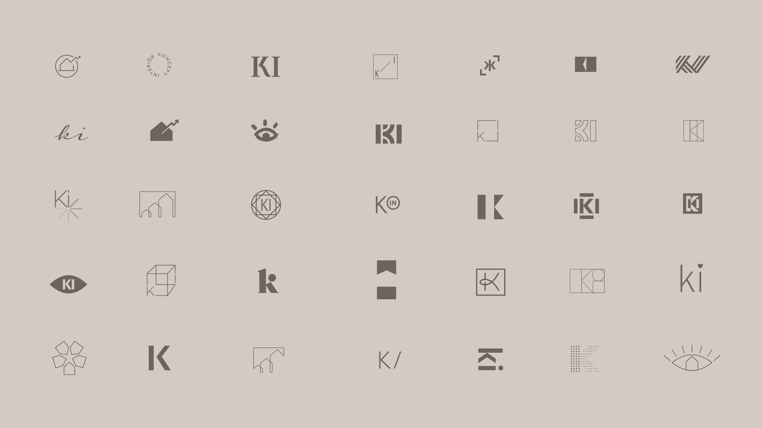
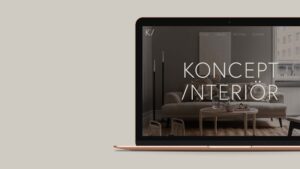
Solution
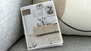
The chosen solution is a very slick and clean graphic solution. Using sans serif type and adding a twist – the slash indicates the drive and will that Erika has to always go the extra mile for the clients. Many of the competitors has script based logotypes – so that was a strategic choice to steer away from that kind of style. Also, many competitors uses black and white branding – for Koncept interiör we chose to work with a brown/beige/sand color scheme – the same sort of colors that Erika uses in her work (make sense, right?). The strong and simplistic look signals quality and professionalism and makes it easier to stand out from the competitors.
![]()
![]()
I really enjoyed your ability to listen. Also, great with different initial design directions that we could work further on to reach an end product that is 100% right for my company. Thanks for swift and very professional help Björn!”
Erika briggner,
Founder of Koncept interiör