Challenge
Create a logo for Mud & Co. The company sells handcrafted soap bars with 100% natural ingredients, beauty masks, bath milks, coconut wax candles and pure beeswax candles. All products have the mud or clay as a common ingredient, hence the company name. The products will be sold through online store, Facebook, Etsy marketplace online, local market stall and word of mouth. The target customers are health and environmentally conscious. They are possibly style conscious too and have a medium level of disposable income. They are active on Social media forums and shop online to purchase handcrafted goods for their unique style and quality. The customers use natural or organic products, they probably eat a healthy diet and values handcrafted products over mass produced products in supermarkets.
The biggest competitors are Burt´s bees, Glasshouse candles, The Body Shop, Lush (Sops and bath bombs) and various soap makers at markets. Words that should be associated with the brand are authentic, trendy, non-toxic, natural, quality, luxury and modern but rustic. When people purchase the products of Mud & Co, they should feel like they have acquired something unique, special and cool that has high quality.
Solution
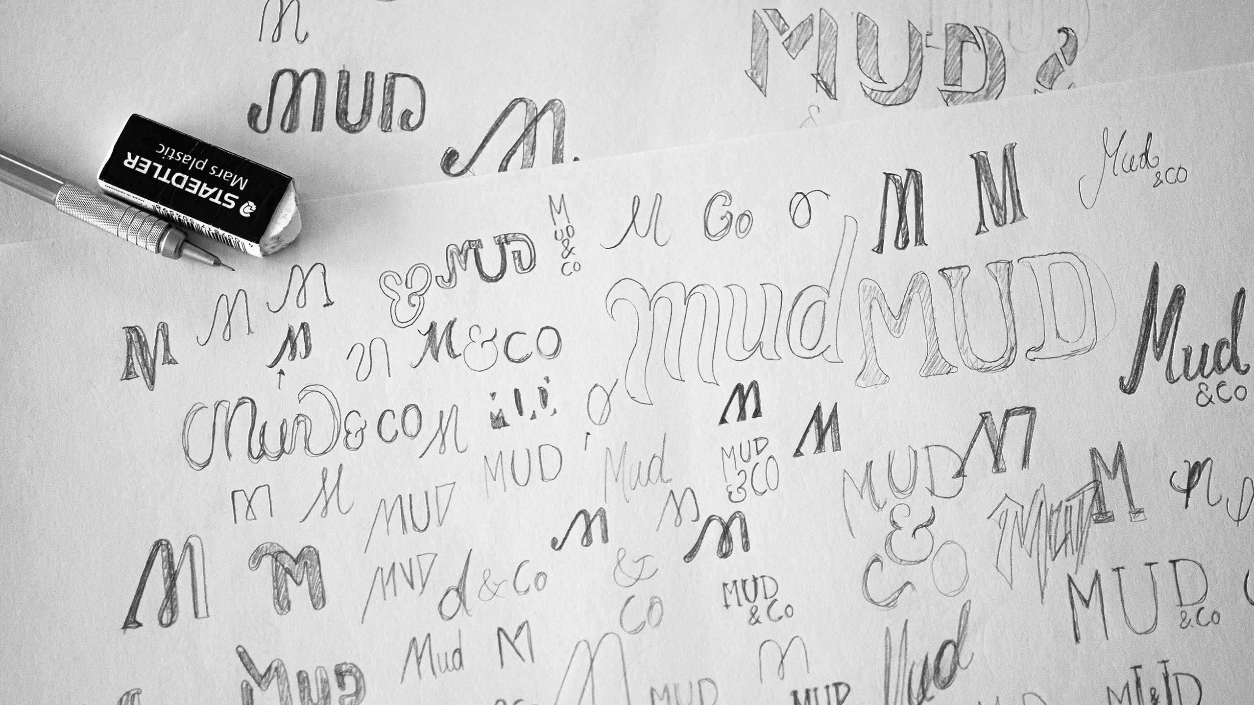
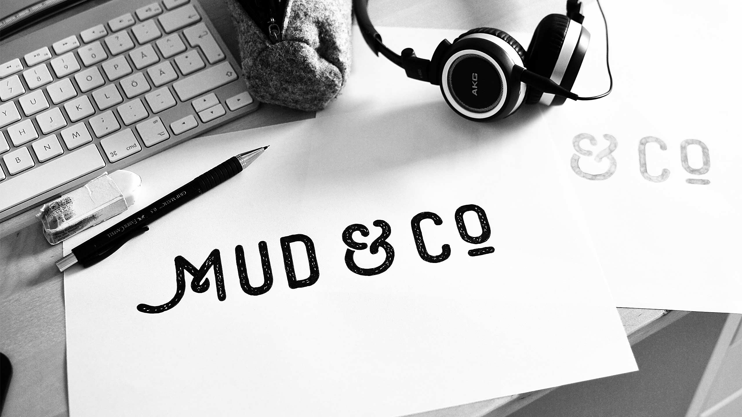
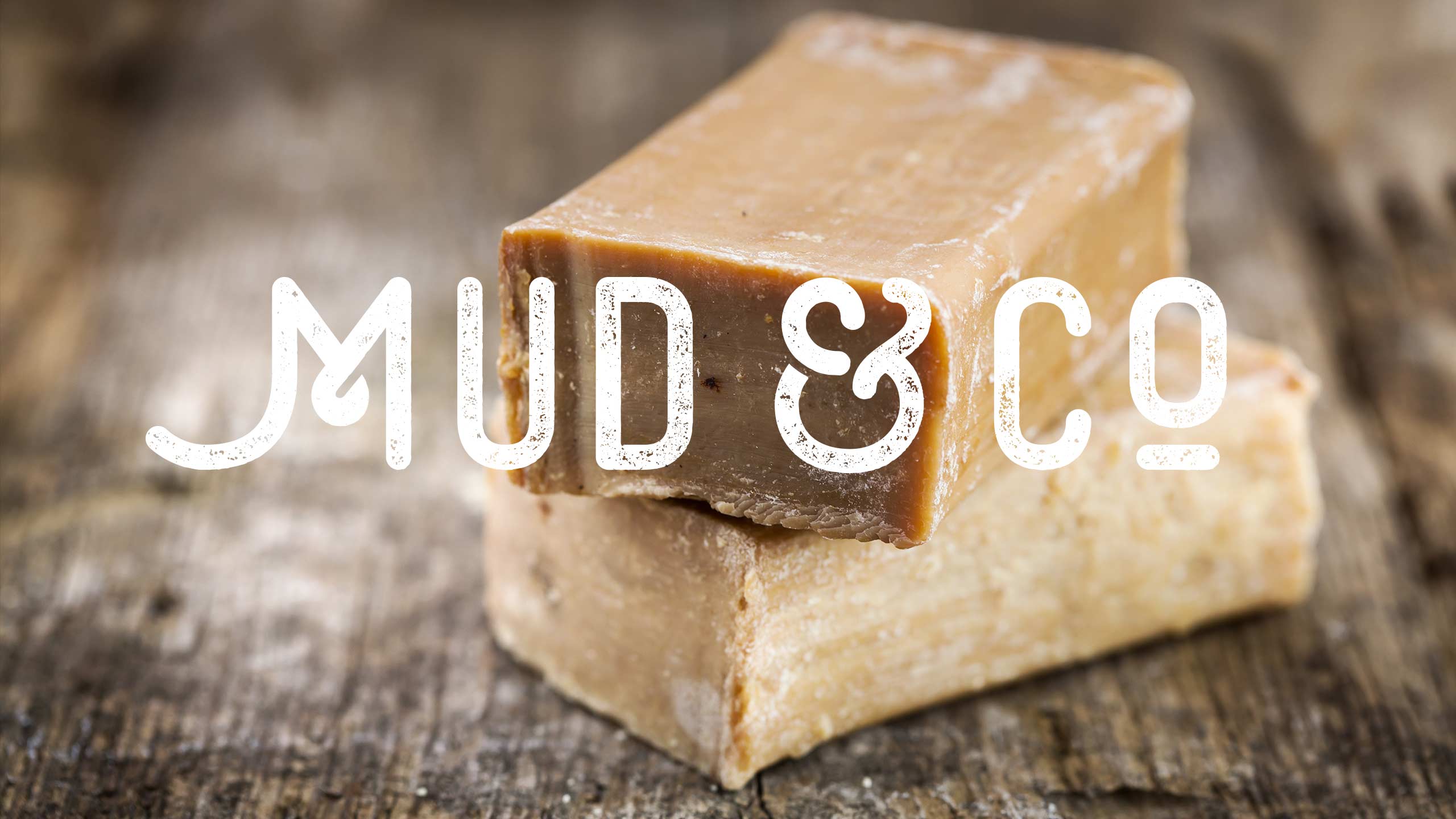
To establish Mud & Co as a quality brand the chosen design is clean and bold together with a simplicity and elegance. Less is more and signals self-confidence. On a subtle level the clean design symbolizes the natural/purity aspect of Mud & Co, no additives, toxics or hidden bad stuff for you, what you see is what you get. The logo design has a clear sense of handcraft over it. The ampersand design and the texture add even more authentic and rustic vibes to the logo. Monoline condensed sans serif letters are trendy, but they also symbolize a long history of craftsmanship.
When you see the logo, you should get a sense of what type of business Mud & Co is operating in. The letters have a roundness and softness that enhances the caring/health and natural beauty/spa aspect of Mud & Co. Besides establishing Mud & Co as being a luxury brand the generous spacing between the letters enhances the feeling of belong to the beauty/spa or skin-caring industry. The logo is consciously pretty bold and simple in shape in order to make it both legible and easy to attach on all sorts of forums, packaging, et c. The use of sans serif letters differs the logo from the ones of Burt´s bees and Glass house candles. The handcraft sense is something missing for all four main competitor’s logos. The strong visual expression of the logo together with the supporting branding of Mud & Co creates a great advantage over the local market soap makers.
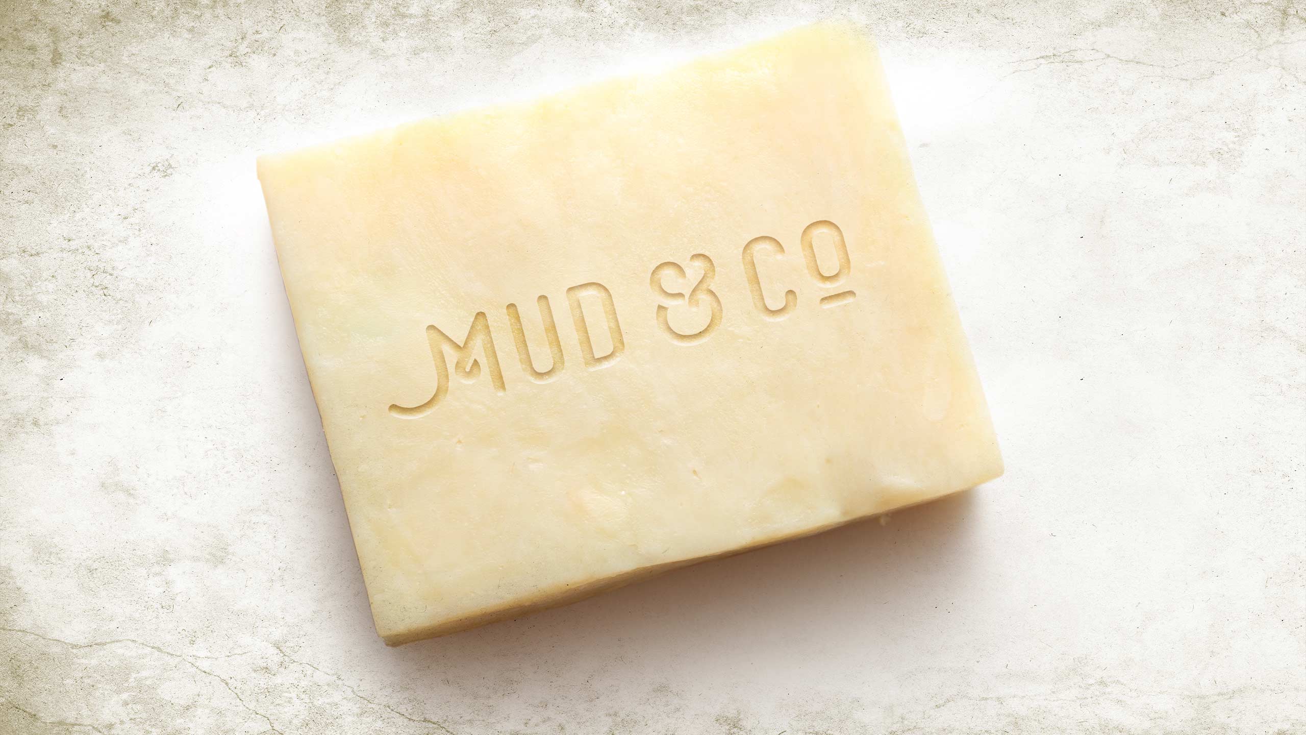
All together the logo design for Mud & Co differentiates the company and makes it stand out in the competition. The ‘M’ in ‘Mud’ has deliberately a unique although simple shape. It helps both the logo to give it its own expression, and it also makes it possible to use only the ‘M’ in certain cases (like for engraving into the soap bars).
I think Björn is awesome on many levels. I love his quick response time and easy and open communication. I also appreciated his friendliness, approachability and thoroughness. I come from an artistic background myself, so I truly respect and admire his skill and craft. Björn is the whole package. True beautiful talent!”
Michelle Davies,
Founder of Mud & Co


