

Challenge
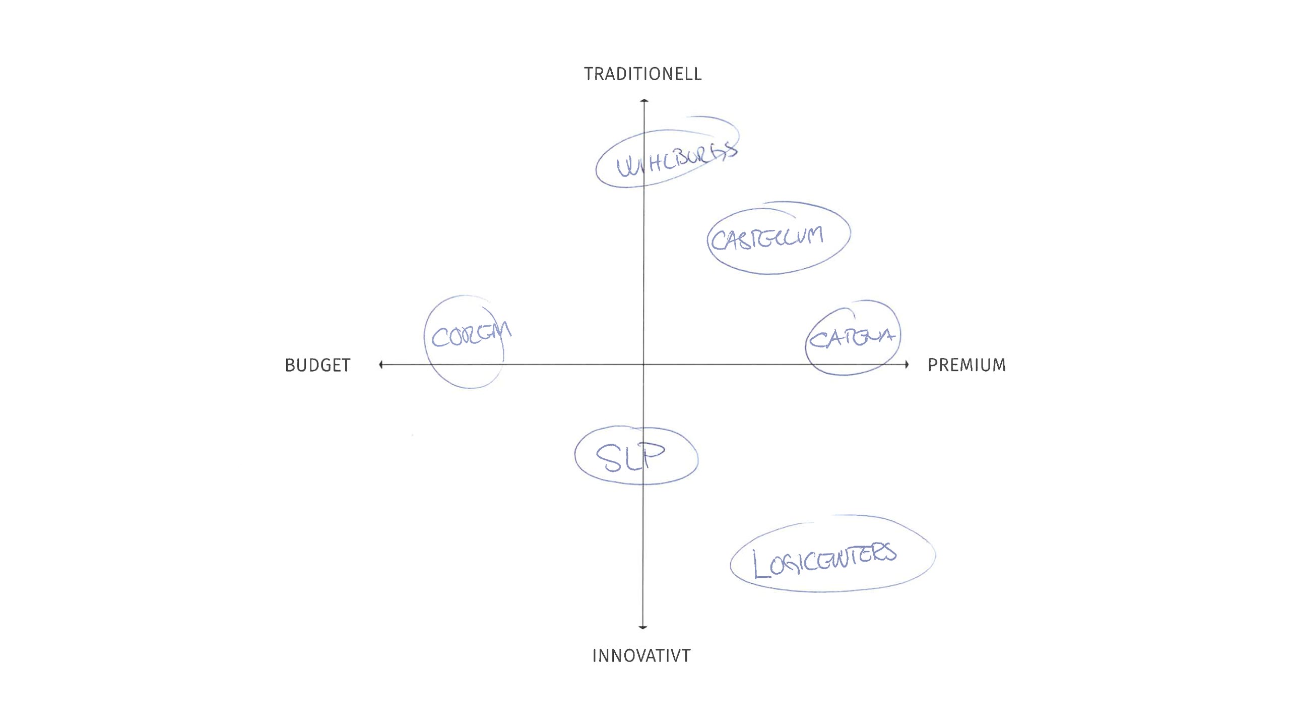
Create a visual identity for Swedish Logistic Property AB (SLP). The company acquires, manages and refines logistics properties, with focus on the southern part of Sweden. They offer their clients strategically placed and tailored properties. The clients will be reached through their network of contacts, branch forums, LinkedIn and advertising. Their most important competitors are Wihlborgs, Catena, Logicenters, Corem and Castellum. Synonymous with SLP are: good listeners, responsive, quick, experienced, thinking new and a solution-oriented focus.
Solution
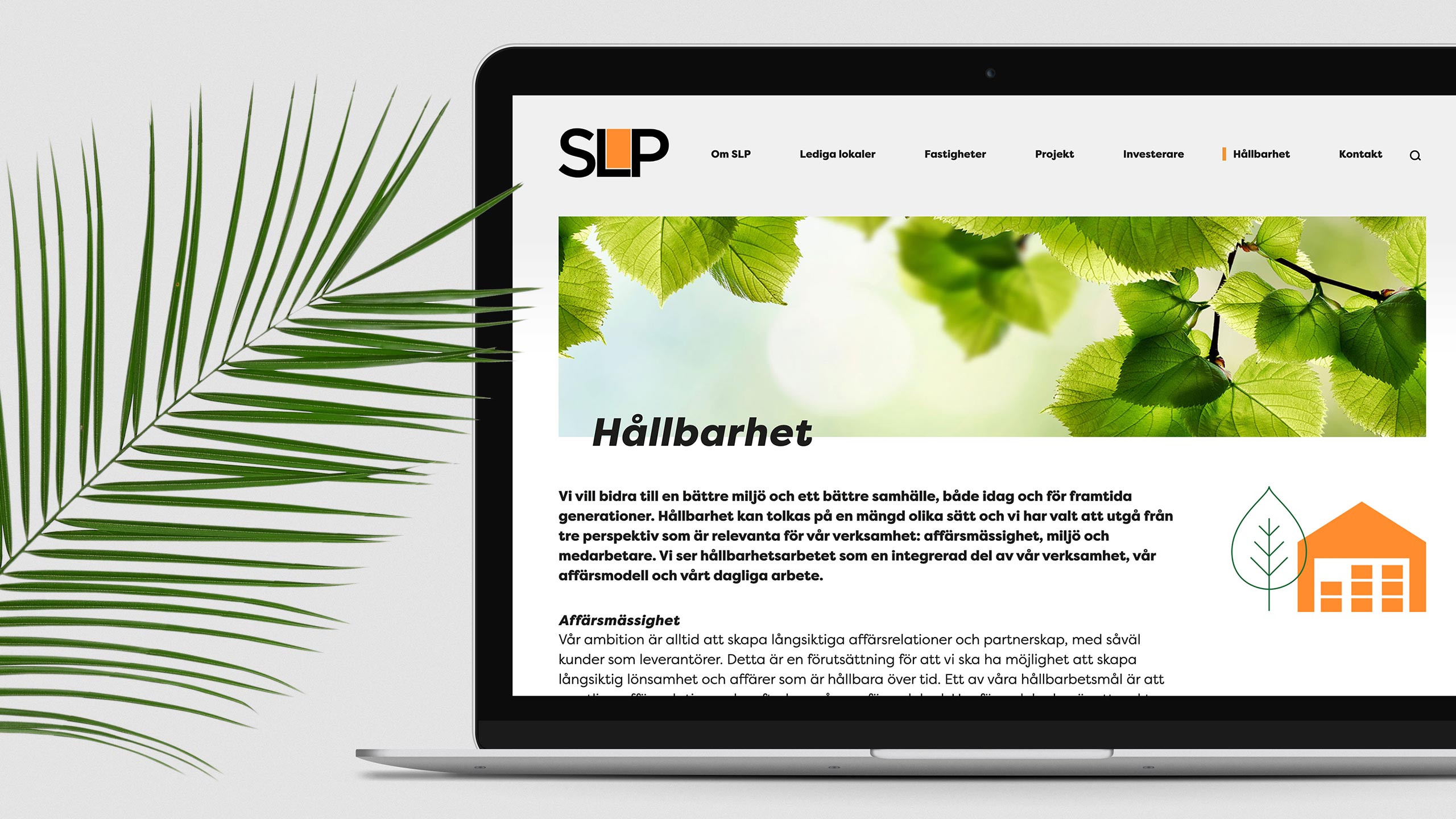
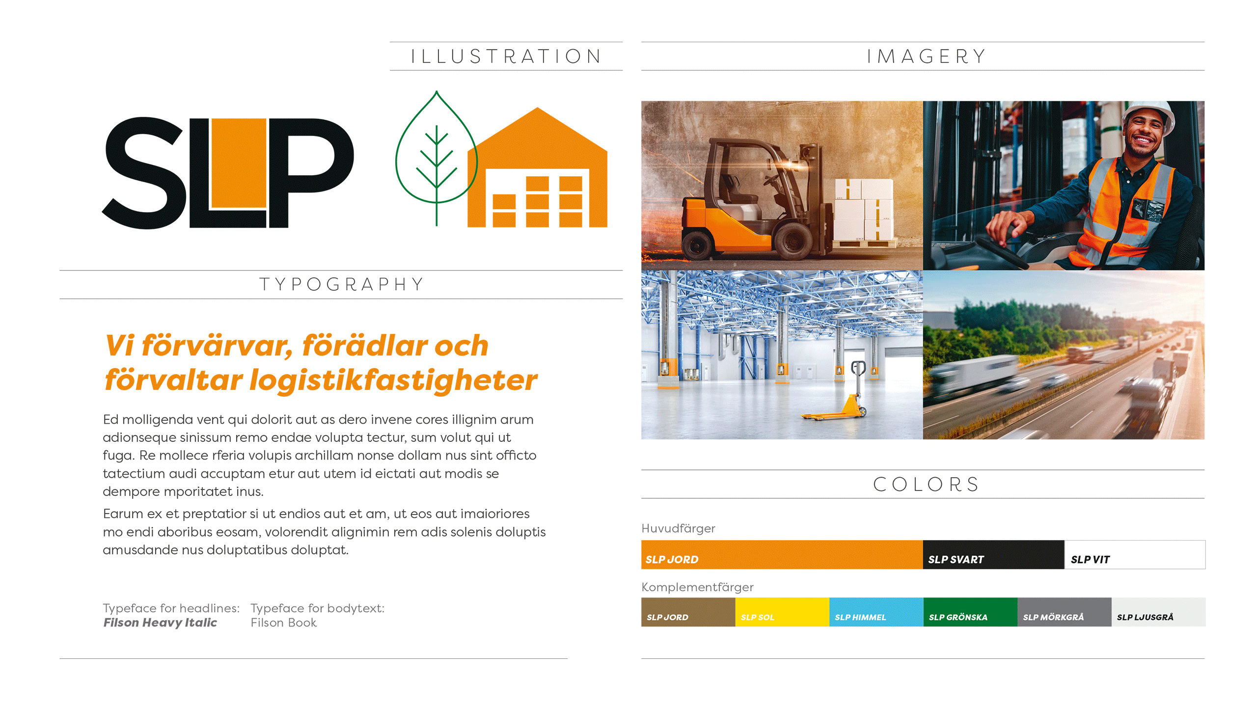
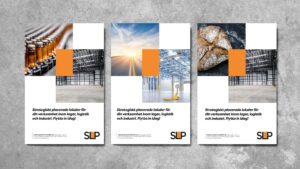
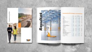
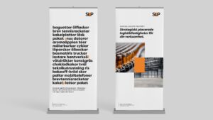
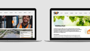
Through interviews with a few of SLP’s clients I found out that the personal contact and their solution-oriented focus for their clients is very strong. To capture that I created a concept that uses the orange rectangle to visually connect the client’s business with the right property. To enhance that SLP are fast and responsive, a bold and italic font style is used for headlines. I also used motion to further enhance the quickness of how SLP work: on their site there is an animation on the landing page, a lot of images have a sense of motion in them and I have also animated the logotype for digital presentations. Their new way of thinking is visualized in for example pie charts that uses a fragmented coin instead of a regular pie chart. The color palette have sprung out of tones found in typical property images and at the same time they enhance SLP’s focus on sustainability. The illustration style is designed to be flexible and to put focus on SLP’s orange color, and also put the secondary colors to use. Overall the visual identity of SLP stands out when compared to competitors. The identity is clean and contemporary, and yet bold and strong.
The result is everything we wished for, and now we have a solid visual foundation to build upon. Besides from being an overall friendly guy, Björn is committed, passionate and full of creative ideas. I appreciate the responsiveness and that he always deliver as promised. After completing the larger projects, Björn now helps us with our everyday branding needs. To keep it short; me and the team truly recommends Björn!”
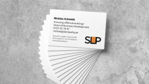
nicklas schmidt,
Head of Business Development at swedish logistic property ab
Friends
The development of the website is being made by Peter Anderhagen at Abrovink Interaktiv Media AB.