Challenge
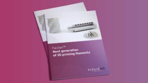
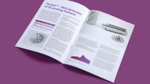
Create a visual identity for ElogioAM (including logotype of course), which is a joint venture between Perstorp and 3D4Makers. ElogioAM is a company that manufacture and develop the highest performance Additive Manufacturing (also called 3D printing) materials worldwide. The company name comes has taken inspiration from the Latin word ‘Elogium’ that means additive – and that is how you 3D print something, by adding layer on layer. The primary customers for ElogioAM are researchers in the medical field, engineers, designers and people working for corporates. Typical competitors for ElogioAM are Innofil 3D, ColorFabb, PolyMaker, E-Sun-3D and Form Futura. Key words for ElogioAM are innovative, bold, reliable and trustworthy.
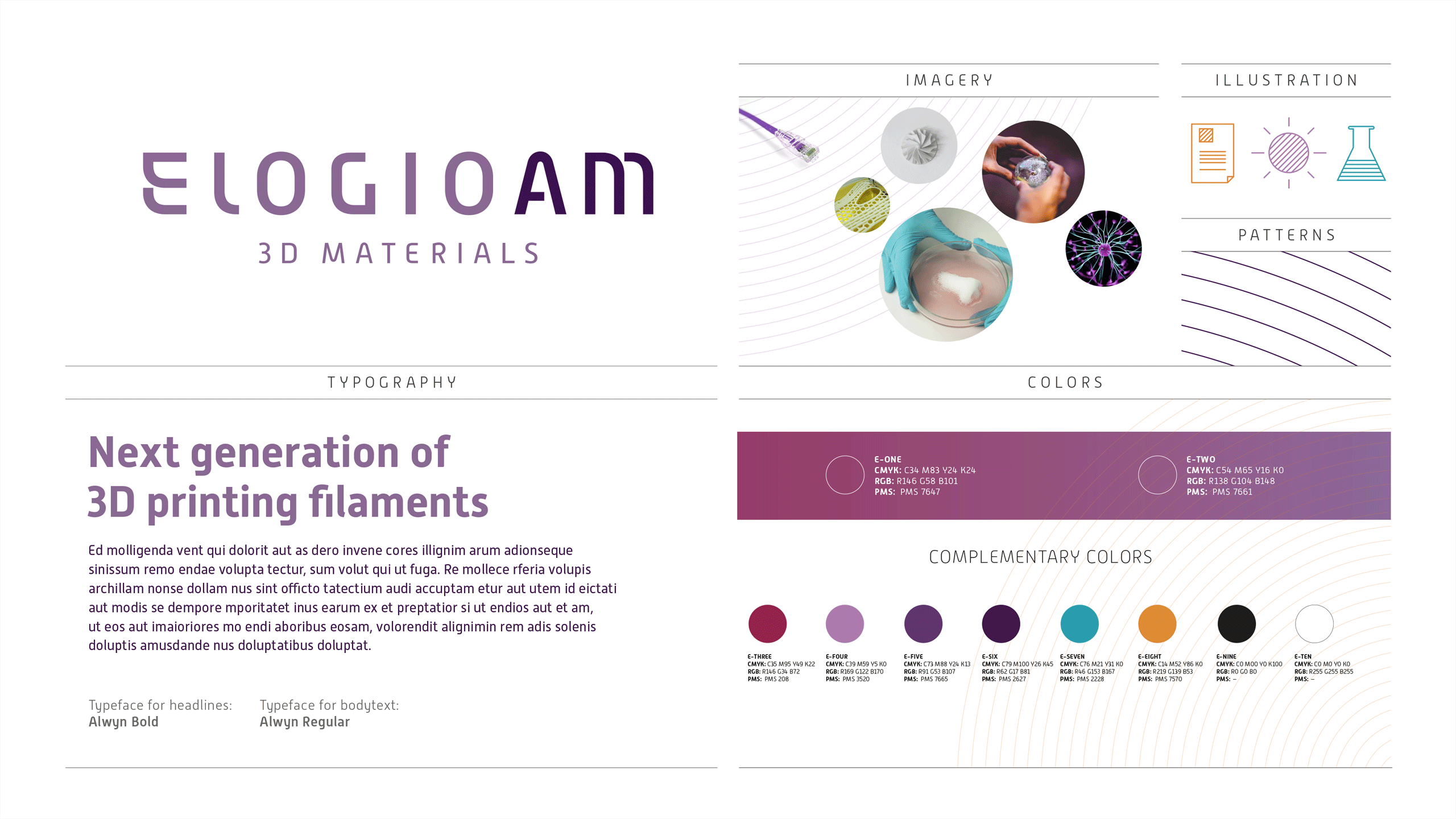
Solution
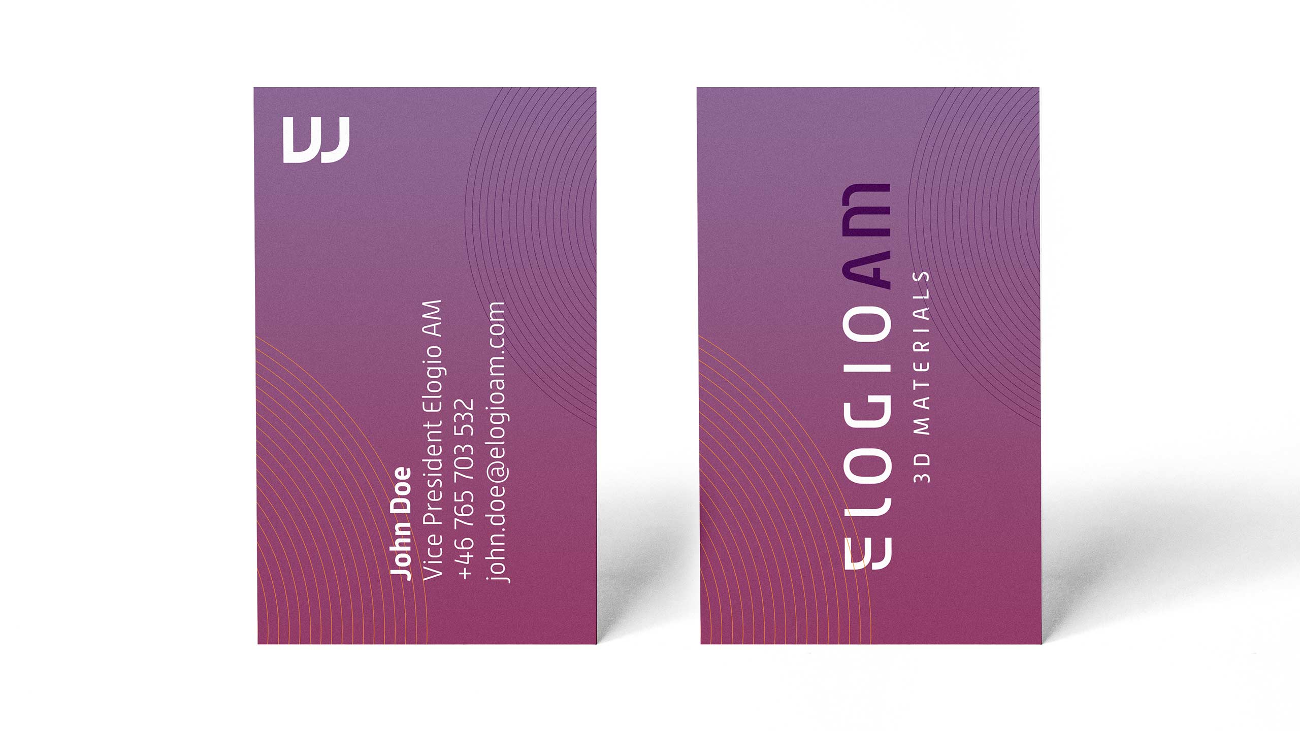
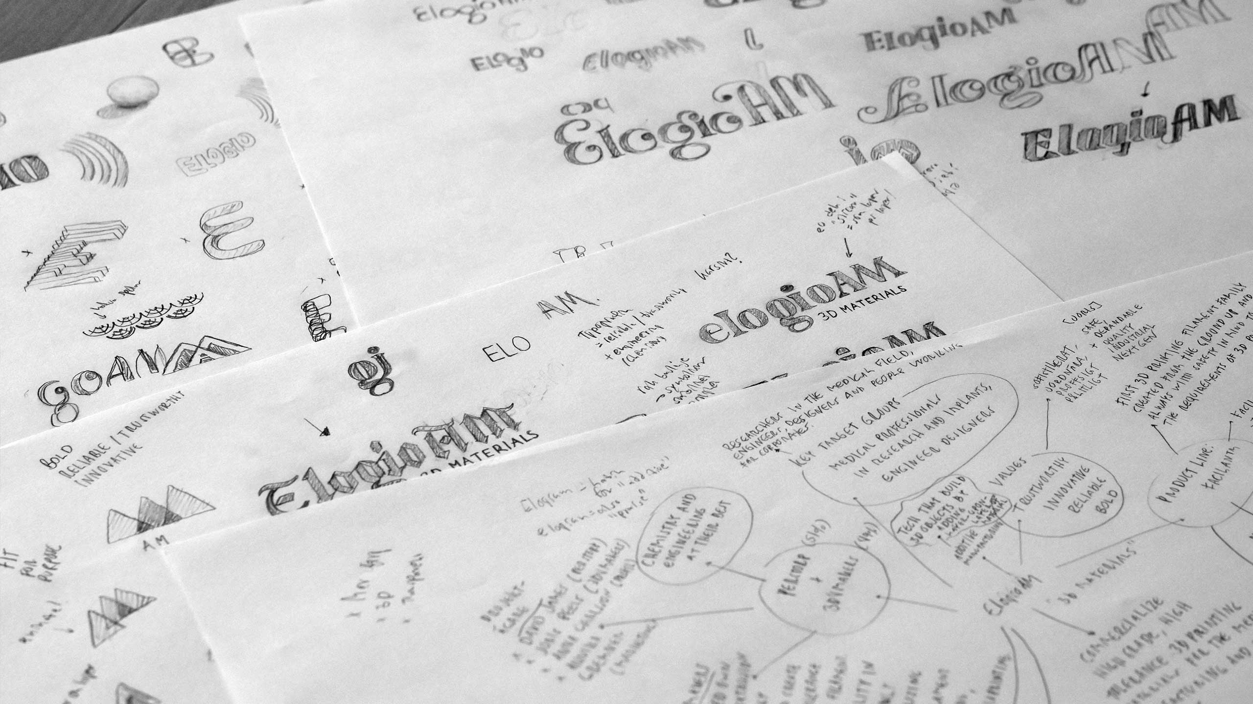
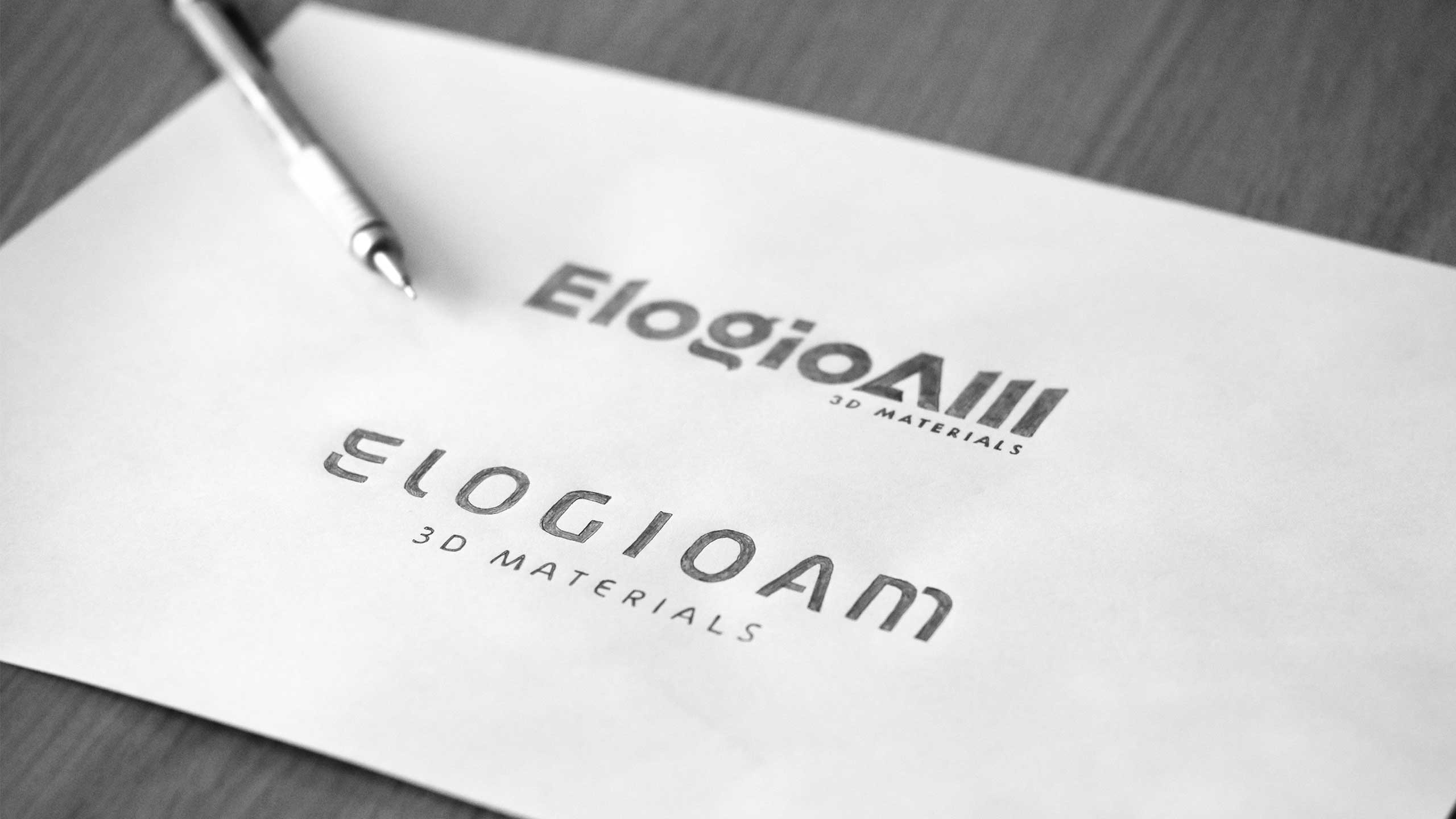
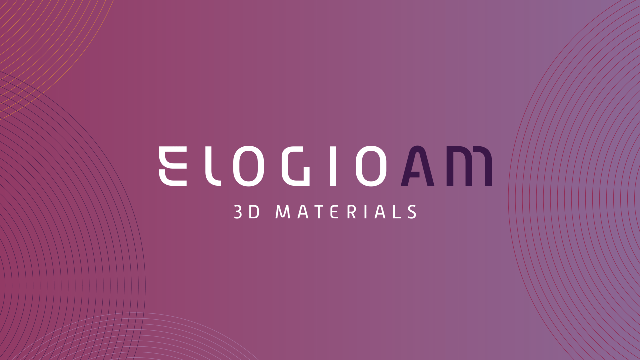
The most important, beside creating something unique, is to evoke the right feelings: The straight baseline in the logo signals stability and reliability. Furthermore, boldness is visualised through the shape of the letters together with the 3D filament cartridge patterns. The overall impression of the visual identity for ElogioAM is a feeling of innovativeness. Overall feeling, colours and typography separates ElogioAM from competitors. Also, the initial ‘E’ is an interpretation of the Latin word ‘Elogium’ that means “additive” – the letter ‘E’ consists of three layers. For spaces that does not allow the use of the full logo I have created the unique and clean ‘E’ – that works well alone, in for example social media profile images.
As I usually do, I wanted to create an identity that feels like it belongs in the branch that ElogioAM operates in, but at the same time create a twist on it to make them stand out. The visual identity is strong, unique and easy to use. As every well-crafted logo shall be, the logo for ElogioAM is easy to recognize and remember, even in cost-effective one colour print.
Björn has done a wonderful job and everybody involved in this project is very satisfied and stoked to put the identity into use.”
Annika Gremner Andersson,
AT THE TIME Vice President Marketing at Perstorp AB